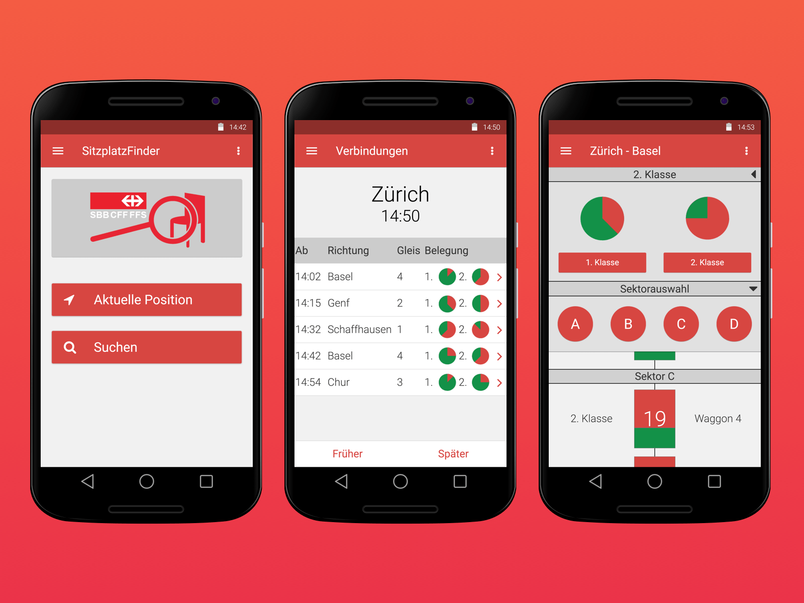
Have you ever been frustrated trying to find a seat on a public transport? Well, this concept might be a solution for that problem. With this app you can view which carriage has how many free seats left and you can get in the right carriage from the start without having to walk through the whole train.
This concept was a product of a workshop I did over the course of a semester at the University of Applied Sciences and Arts Northwestern Switzerland. The goal was to create a functional prototype and learn all the usability processes. This was the first time I ever heard about usability and I already knew this is something I’m going to like.
Process
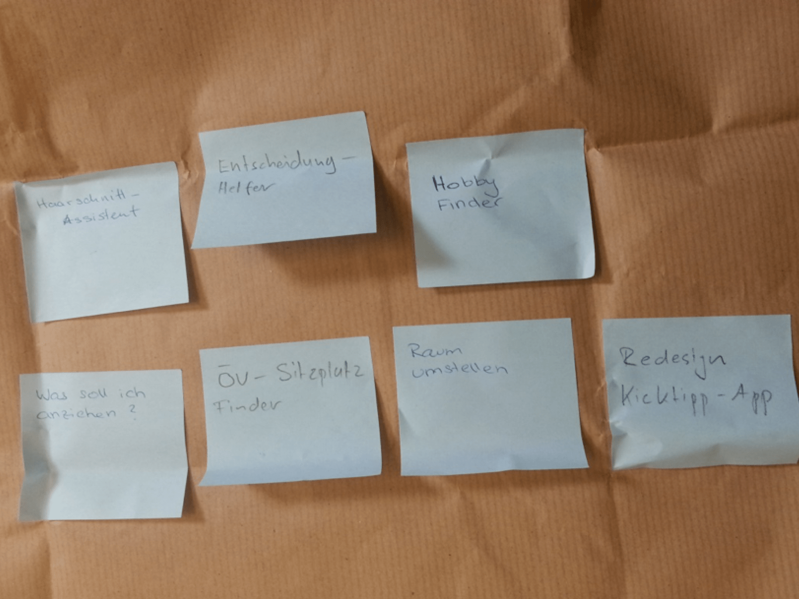
This project started as a group of four project and the final product had to be done by each member individually. We started with brainstorming for an idea for a mobile app or web app and after few short sessions we had our idea.
After we settled for an idea we were tasked with creating a survey, we got a template and with it we knew what kind of questions we needed to ask to get the information we wanted. It was interesting to see how many information we could get by asking just a few simple questions. After we created the questions in Word, we made a SurveyMonkey form and sent it to all the students at FHNW and some private parties, who might be interested in this idea.
Two weeks later we had enough data from the survey to analyse it further and filter out erroneous data. It was my first time using SurveyMonkey and it was a great tool to work with, especially the charts were very helpful. With the clean data our next step was to create a persona.
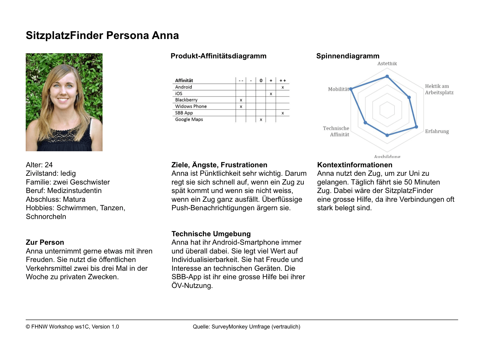
I never even heard this word before and had no idea what it meant. After we learned what it is, I was fascinated by how useful a persona can be for developing a software or basically anything. It was actually not that hard for us to create the persona with the data we had from the survey. We only created one persona, because we didn’t have time to go into too much detail, so we made sure that the one we had is as much detailed as possible.
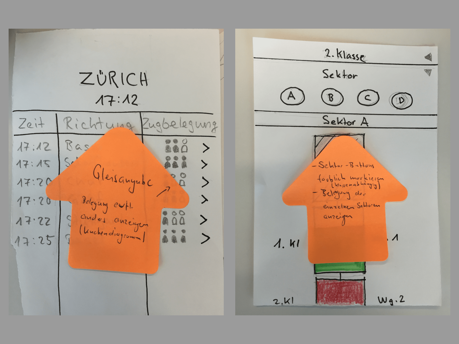
Now that we had our persona, it was time to create a paper prototype. We divided the work between us four and everyone worked on one screen specifically, but we also exchanged information while creating them. Then we all sat together and discussed what is good and what is bad. After that we decided which way to go with the paper prototype and created the final version of it.
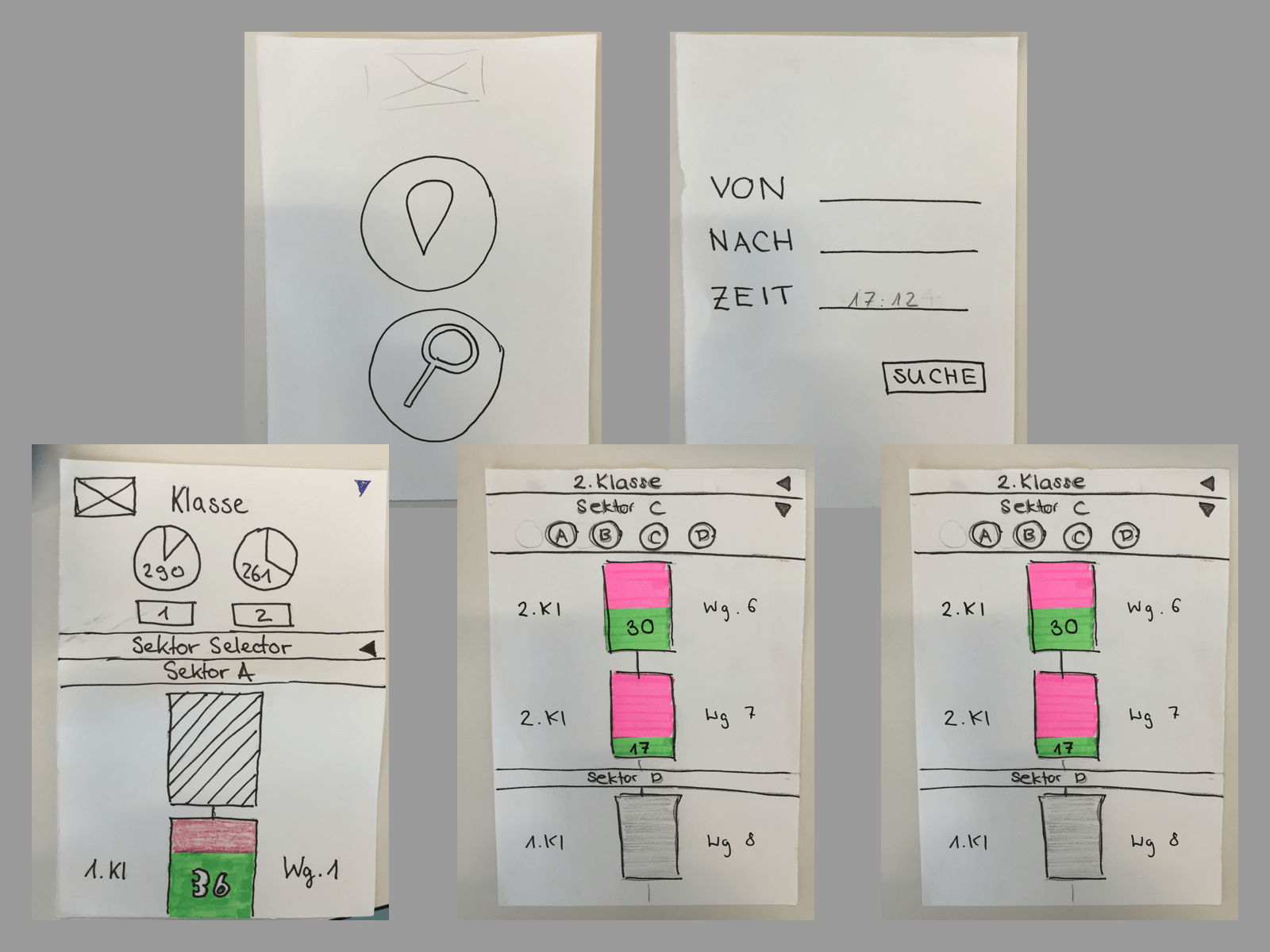
With this version we were tasked to do a basic usability test and the tester was someone from another group in the workshop. Since each group sort of knew what the other groups were doing it was not the perfect tester to do a usability test with, however we still got some good feedback. The testing method was just sitting together with the tester, asking that person to do certain tasks and taking notes of what we thought was interesting. We did that with two testers and collected the feedback, which actually helped us to improve some of the UI.
After all these steps it was time to create the final working prototype in Axure. I never worked with Axure and the introduction in class was very short due to time restrictions, so I had to learn most of it from googling and watching Youtube videos. I decided to make my prototype for Android, because I’m a big fan of Google’s Material Design and thought this would be the ideal time to read up on that documentation. It was actually very interesting to read a style guide for the first time and I tried to follow it as much as I could in my prototype.
One thing that I really wanted to get as perfect as possible was the floating labels just like how they would work on any Android app, so I spent a lot of time creating this feature in Axure, which it didn’t have out of the box. Overall I spent about two weeks creating this prototype, which also included creating an icon for the app in Adobe Illustrator.
Lessons learned
For all the work I’ve put in with customising everything so that the prototype looks as much as a normal Android app, I’ve got the best grade in my class and it was a good feeling to know that hard work pays off. Most of the tools I got to use were entirely new to me and thus I had to take my time with each tool and learn to use them properly. But I learned the most of Axure, because it was a tool that really interested me and I was fascinated with all the possibilities.
I also learned to work in a team, what it means to spread the work, help each other out, communicate and generally be a good team member. Although the final result was an individual product, I learned that all the work we did before was also as important, because without all that work this final prototype wouldn’t have been possible to create. This also showed me that usability is something that takes time and goes through many steps before it finally gets applied. There was also some negative feedback about my prototype, which made me realise there is no perfect product and that usability is an iterative process.

