Ever since I learned about HTML and CSS, the web was something that interested me a lot and I always wanted to create a personal website, but I never had a reason to create one until this project. During my studies a friend of mine was working on his own personal website and it made me only more curious to want to create one for myself. However due to all the other stuff I had to do during my studies, I put this idea on hold and now I finally did it.
Goal
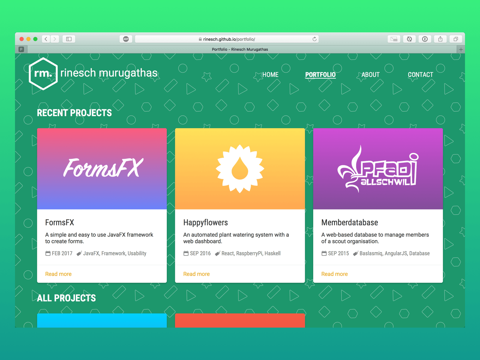
As soon as i started to work on this, my goal was clear from the beginning, I wanted to showcase all the projects I have done during my studies in a way that was easily accessible to anyone. Another important goal was to create a personal brand for my online identity.
Process
Before I started doing anything for my portfolio website, I looked at a lot of portfolio websites online and noted the things down that I found interesting. At the end of it I had a long list of ideas and inspirations, now it was time for me to make the hard decisions. There were so many good ideas, but I had to settle on one. So I collected all the final ideas I wanted to do and made one final list.
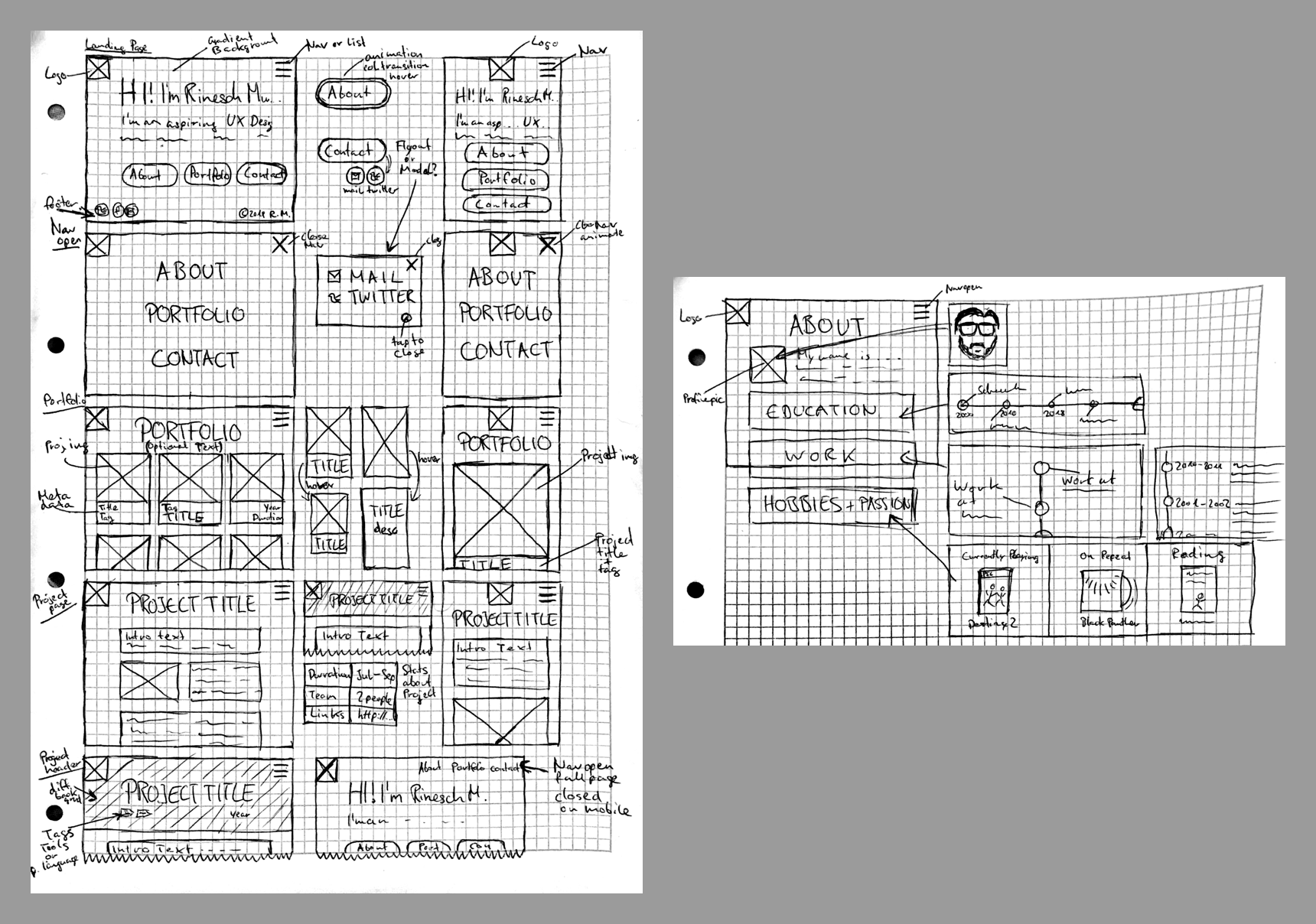
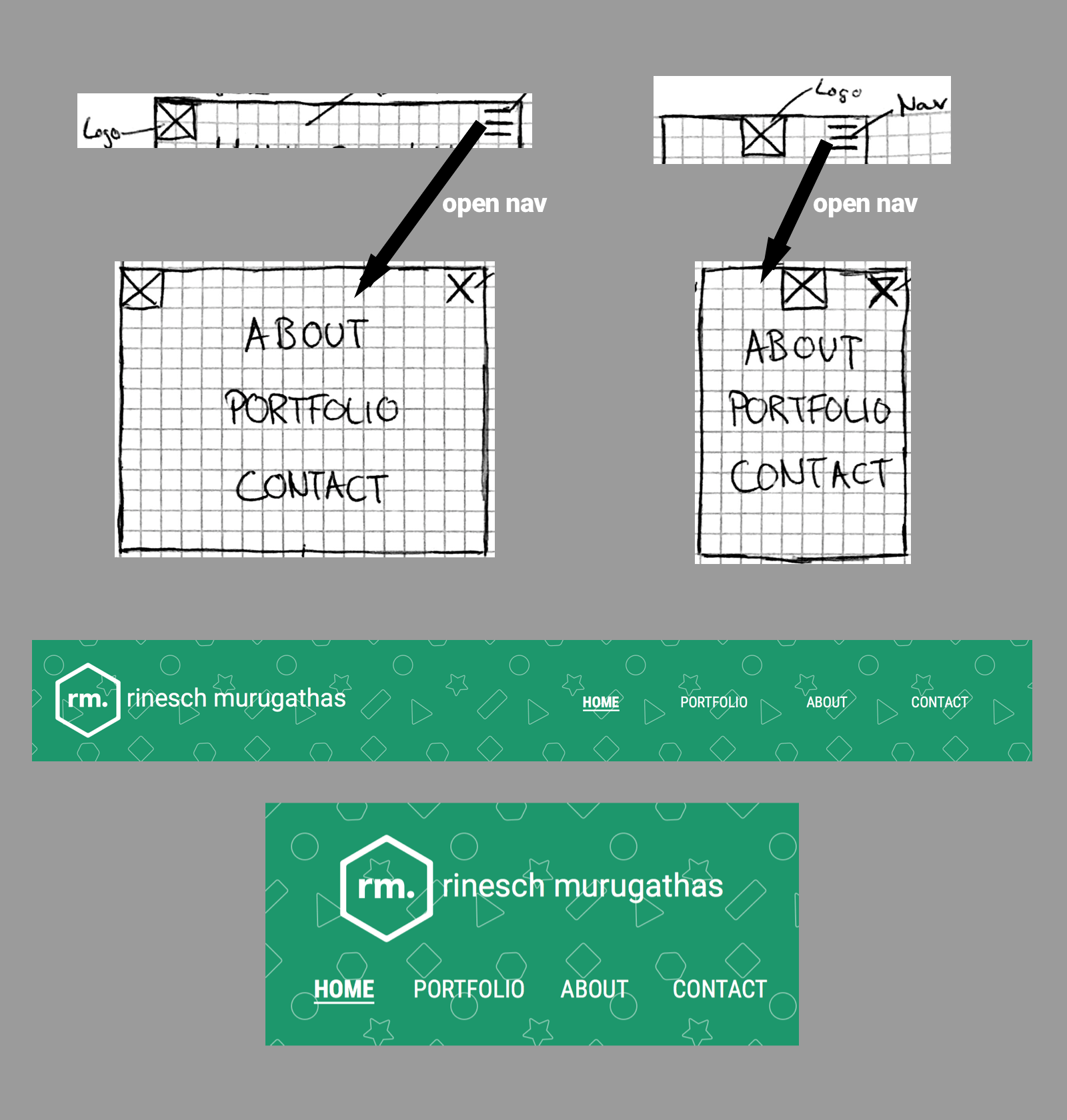
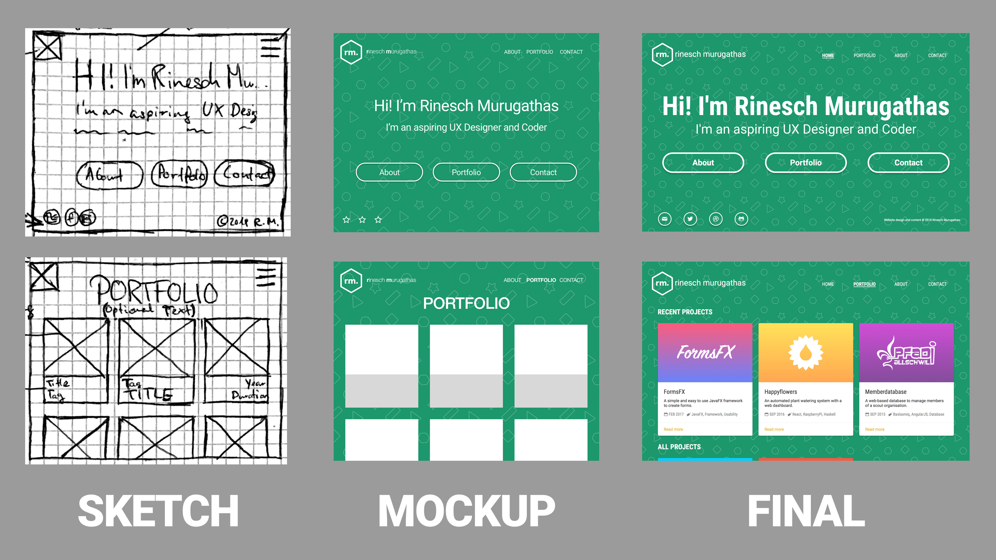
With this list I started to sketch some screens and how I wanted them to look. I also wanted the portfolio website to be accessible on mobile, so responsive design was a must from the start. That meant I had to consider how the layout and design will change for mobile while trying to keep the overall look the same. So when I was sketching the screens I also sketched how it should look like for mobile.
After I had some basic sketches I could already see how I wanted the website to look and started to think about creating my own logo. I had a lot of ideas and all were centred around my initials as I thought that would be the best for a personal portfolio website instead of a random symbol or design. I just started writing my initials down in different ways and played around with them until I had a few I really liked and then finally chose one.
While working on the logo I was also thinking about the background for the website and I always liked websites with patterns. I knew I wanted patterns, but didn’t know of what kind, so I looked online at different patterns and most of the ones I found were good, but I didn’t like any of them enough to use it for my website. While looking for patterns I stumbled up on this guide and I really liked his tutorial, so I thought I’ll make my own pattern.
I started creating the pattern with icons that would suit me personally, like a book, game controller, glasses, pencil and stuff like that, but once I had the pattern finished, I didn’t like how the background was taking away too much attention from the website. So I decided to keep it simple and looking at my logo with a hexagon, shapes, came to my mind and there I had the final idea.

Now that I had a logo and a background I started to think about making my personal brand. My favourite color is green, so I decided to make that my main color and combined that with white. With the colors decided for the website I updated the logo and pattern to work with the chosen colors. Seeing the logo and background colored I started to really like the overall look of my brand with shapes and my name.
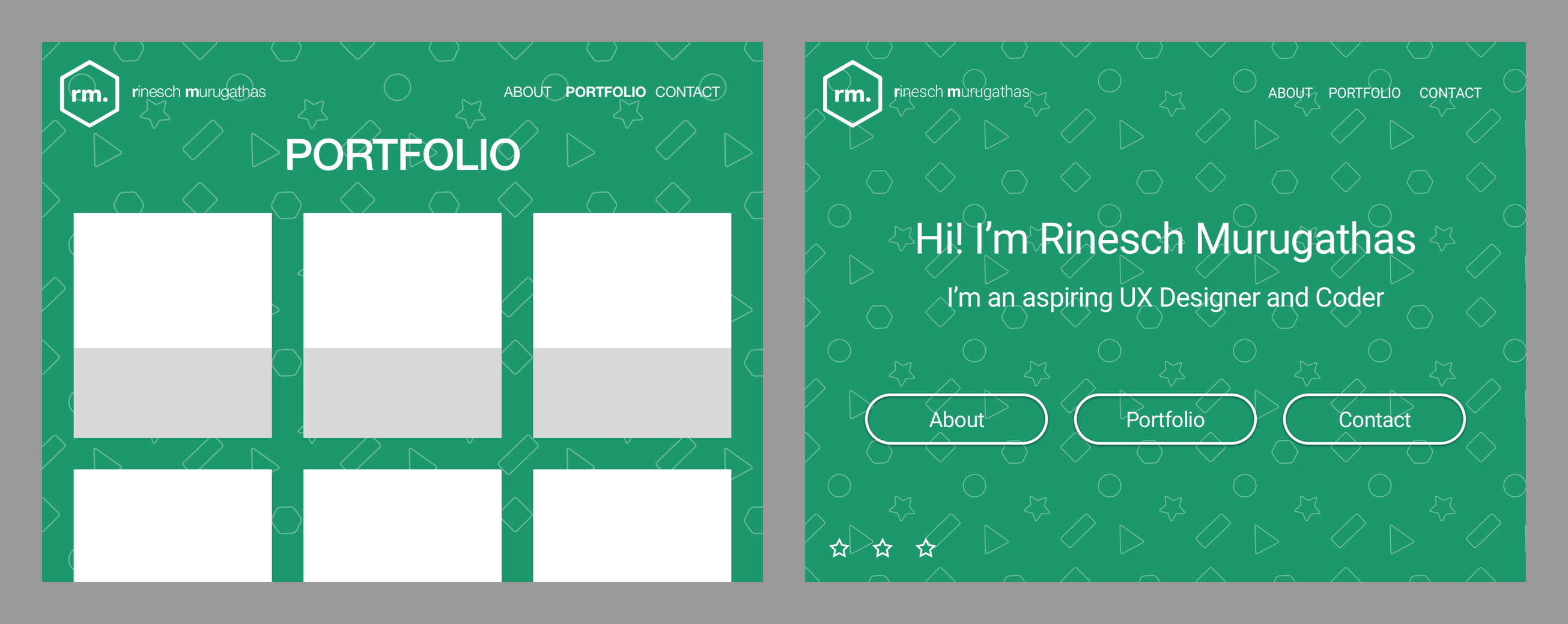
Originally I didn’t plan to create mockups, but while I already had the pattern and background in Sketch, I thought why not quickly put together some mockups. So I created a few mockups and immediately noticed that I wanted to change some things around from how I initially sketched it earlier.
With all of the planning done it was time to start developing the website with GitHub Pages and Jekyll. Thanks to my friend’s website I always had reference point if I got stuck doing something, but most of the time I still had to google some things.
While working on the website I started to realise that some ideas from my sketches were overkill for a simple thing. One example would be the navigation, I originally planned to do a fly out navigation with animation, but in my opinion it was not necessary for only four links. If I had more than four links then it might’ve been more practical, but for these links I could just display them at all times.
Once I was finished with creating and designing the website it was time to start writing the portfolio posts. I already had the design and layout for the posts finished before I even started writing them, but as I was writing I realised that I forgot to design how images will be placed, so I had to add that. After finishing the first post, I looked at it and realised that I didn’t have any sections or anything, which led to a poor reading experience, so I structured the post into logical sections. With these sections it also helped me to write the other posts much quicker.
Lessons Learned
When I started this project I wanted to do it in a PDF first, because I thought that would be the easiest and quickest way. However after I designed a basic template for the posts, I realised how time consuming it would be to update these posts if I ever wanted to change the design. Another reason was sending big PDFs isn’t easy and require separate tools, so I thought a personal website would be the best way to share my portfolio with other people.
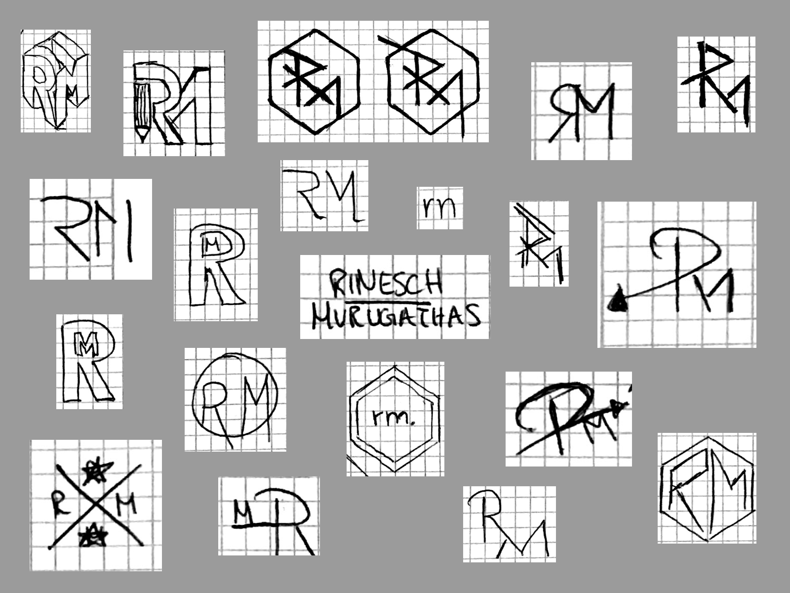
Creating the logo wasn’t as easy as I thought. I spent a full day designing and experimenting to find my final logo. There were so many ideas, but most didn’t work for all the situations I needed the logo for, like the sizing on some needed to be fix or they would not look the way I intended them to look like. I have to say I really like my final logo, it’s minimal and simple, just how I like it.
Looking back at the mockups I’m really glad that I made them even though I didn’t plan on doing them. Thanks to these mockups I noticed early on that I wanted to change some things around and also allowed me to see that I forgot to put in some important things as well. Also looking at an almost finished look of the website made it easier for me to design the other screens when I was coding the website.
Before I even started to plan this project I initially thought creating and coding the website will take much more time than to write the posts. A friend also told me that writing posts is harder, but I didn’t believe him then, guess I was wrong. I was really surprised how hard it was to write a post, especially trying to keep it short and to not overwhelm the reader.


